User-defined Fields
The real power of Acorn lies in its ability to hold custom metadata against assets stored in its catalogs. This custom metadata can hold just about any information that a given workflow or business process requires.
Custom metadata is stored as a set of user-defined fields associated with each asset object (catalog, clip, marker, source media, import source or clip list). Each user-defined field has a unique identifier, a display name and a type. The type specifies both what kind of data is to be stored (text, number, date etc.) but also the user interface element used to enter that data (simple text field, picklist etc.). Certain field types have additional configuration data, such as the set of values for a picklist, or the color of a select button.
User-defined Field Types
Each user-defined field in Acorn has a specified type, that determines both the type of data stored in the field and the user interface for entering that data.
This section details the supported types:
Plain Text
A single line of plain text value edited using a single line text input control.
Multiline Text
A multi-line text value (i.e. one that can contain newline characters) edited using a multi-line line “text area” input control.
Picklist
A text value selected from a list of pre-defined values (the picklist). The picklist field supports additional options:
· Extendable – the user is allowed to enter a value that is not in the predefined value list.
· Saves Values – values entered by the user that are not in the set of predefined values are added to that list on the fly and saved for subsequent use.
· Keep Sorted – values are automatically sorted into alphabetical order
Multi-select Picklist
A set of text values selected from a list of predefined values (the picklist). The user may select more than one value from the list, and they are stored as multiple independent values in the field. The same options (Extendable, Saves Values etc.) that apply to simple picklists also apply to multi-select picklists.
Auto-suggest
Similar to a simple picklist but as the user types a value into the input field the list of picklist values is dynamically filtered to just those values that start with the text the user has typed so far. This is useful for large picklists.
Multi-value Auto-suggest
Provides the same functionality as the auto-suggest picklist field but allows the user to select more than one value.
Hierarchical List
Allows the user to select a value from a set of predefined values, by drilling down through a hierarchical tree. This is useful for presenting a large number of values that naturally form a hierarchy (such as selecting a city by first selecting the continent and then the country and then the city).
Multi-select Hierarchical List
Provides the same functionality as the hierarchical list field but allows the user to select more than one value.
Checkbox
A true/false value edited by checking a checkbox control.
Multiple Checkboxes
A set of text values edited by checking one or more checkbox controls. The set of values is defined in the field definition’s data section.
Radio Buttons
A single text value chosen by selecting one of a set of radio button controls. The set of values is defined in the field definition’s data section.
Select Buttons
A single text value chosen by clicking one of a set of buttons. The set of available values is defined in a picklist associated with the field definition. The selected button is displayed in a bolder color and shows a check to indicate it has been selected.
The color (or colors) of the buttons can be specified in the field definition’s data section. To define a color to be shared by all the buttons the data field should contain a single CSS color value. To define separate colors for each value a color lookup table can be provided, with one entry per line consisting of value:color. For example
Apple:green
Banana:yellow
Grape:#FF00FF
Multi-Select Buttons
Provides the same functionality as the select buttons field but allows the user to select more than one value.
Date
A date value selected using a date picker control.
Time
A time value selected using a time picker control.
Date and Time
A date and time value selected using a date/time picker control.
Number
A number (integer or floating point) value.
Identifier
A text value with constraints on the allowed characters that may be entered to ensure that value is appropriate for use as an identifier.
No Punctuation
A text value with constraints on the allowed characters that may be entered to ensure that value contains no punctuation.
Regex Validated
A text value with constraints on the allowed characters that may be entered based on a regular expression stored in the field definition’s data section.
Rating
A number value from 0 to 5 entered by selecting from zero to five stars.
HTML
An HTML formatted read-only field – usually set from a worker action or JavaScript – that allows static data to be presented with embedded formatting (e.g. a table of data).
JSON Value
A JSON formatted read-only field – usually set from a worker action or JavaScript – that allows structured data to be stored. Commonly JSON fields are used purely by background workflows to store data against an asset. However they may be displayed in the user interface is desired. By default the raw JSON is displayed (mainly useful for debugging), but an HTML template can be specified in the data field of the field definition that can be used to format the JSON data as HTML for display.
HTML Templates
A HTML template is a block of HTML text with additional special tags (enclosed in <% %>) plus variable substitutions (${variable}) that allow a JSON object to be formatted as HTML.
This is an example template:
<h2>${result}</h2>
<table width="100%" border="1">
<tr><th>Name</th><th>Format</th></tr>
<%for(clip:clips)%>
<tr><td>${clip.name}</td><td>${clip.format}</td></tr>
<%endfor%>
</table>
The template is essentially HTML with some additional tags to allow the HTML to display data extracted from the JSON data object stored in the Job object.
To display a single value the following variable reference may be used:
${variable_name}
${object_variable_name.propertyName}
This substitutes the value of the variable into that position.
If the JSON contains an array of values these can be iterated over using the following tag:
<%for(loop_variable:array_variable>%>
<%endfor%>
This will repeatedly apply the template contained within the open and close tags setting the loop_variable to each value in the array. Note this loop_variable may be an object.
Parts of the template can be optionally emitted based on the following tags
<%if(variable)%>
<%else%>
<%endif%>
If the specified variable is set then this outputs the first part otherwise the else part.
For example – if the value of the JSON was:
{
"clips": [
{ "name": "clip 1" , "format": "mp4"},
{ "name": "clip 2" , "format": "mp4"},
{ "name": "clip 3" , "format": "mp4"}
],
"result" : "Success"
}
And the template from jobDataDesc was:
<h2>${result}</h2>
<table width="100%" border="1">
<tr><th>Name</th><th>Format</th></tr>
<%for(clip:clips)%>
<tr><td>${clip.name}</td><td>${clip.format}</td></tr>
<%endfor%>
</table>
Then the result would be:
Success
Name | Format |
clip 1 | mp4 |
clip 2 | mp4 |
clip 3 | mp4 |
Calculated
A calculated field does not store a value, instead the displayed value is calculated on the fly using either JavaScript or simple variable substitution.
An example of variable substation:
The name of the clip is ${clip.name}
A simple JavaScript to accomplish the same thing would be:
js:"The name of the clip is" + clip.get("clip.name")
Note that the JavaScript expression must start with js:
Colored Labels
The value returned by a calculated field may be prefixed with a color value that is displayed as a colored background behind the result. For example:
js:"#FF0000:This text will be displayed on a red background"
Calculated Picklist
The calculated picklist field provides the same functionality as a regular picklist field, but the set of values the user selects from is calculated on the fly using JavaScript.
The script can also make use of any of the usual functions from the Acorn JavaScript API, and can access the following scope variables:
· picklistValues – an array of strings containing the pre-defined picklist values if present
· clip – the currently selected clip
To allow asynchronous operations to be performed the picklist values are returned to Acorn using the following callback:
· setValues(values:string[]) - callback function to return the clip list values to Acorn
Example
var values = [];
for(var i=0; i < 10; i++)
{
values.push(“Value “ + i);
}
setValues(values);
Calculated Multi-select Picklist
Provides the same functionality as the calculated picklist field but allows the user to select more than one value.
Colored Label
A very common use case for calculated fields is to display colored status indicators (for example showing a green label to indicate a background operation, such as a transcode or archiving, has completed successfully, and a red label to indicate it has failed).
The colored label field is simply a calculated field, but with a wizard that generates the required JavaScript to display different values from a specified field in an appropriate color.
Clip Updated Flag
Special field type that is automatically set to the value specified in the field definition’s data field whenever a clip is updated. This field is intended to be used to drive change-based workflows (for example copy all new or modified clips to another server).
For example, if a Clip Updated Field called Send Status were created with a data field of Send to Remote Server then every time a new clip was created, or any change was made to an existing clip, then the Send Status field would automatically be set to Send to Remote Server . Thus a worker server query action that looked for clips with the Send Status field set to Send to Remote Server would trigger whenever a new clip was created or whenever any change was made to any clip.
Linked Picklists
A common requirement is restrict the set of values a user can select from a picklist based on other values set on the same clip to implement taxonomy entry. For example it might be desirable to log the location of some footage by selecting the country and then having a separate city picklist just show the cities within that country. This can be achieved using linked picklists.
In Acorn any picklist can be linked to any other field by entering the field identifier of the other field into the Linked to Field section of the picklist editing form. When a picklist is linked to another field, the values displayed in the picklist are filtered based on the value of the linked field. To indicate which values should be displayed for each linked value, the picklist values must use a special format:
<linked_field_value>/<picklist_value>
For example – using the country/city example above – the city picklist might look like:
England/London
England/Manchester
England/Sheffield
France/Paris
France/Lyon
Germany/Berlin
Germany/Frankfurt
It is possible to link to more than one field by specifying multiple field identifiers in the link to field section, separated by a / character. The picklist values would then need to take the form:
<linked_field1_value>/<linked_field2_value>/<<picklist_value>
Managing Field Groups
used to specify to which object (Catalog, Clip, Marker etc.) fields will apply.
Managing User-defined Fields
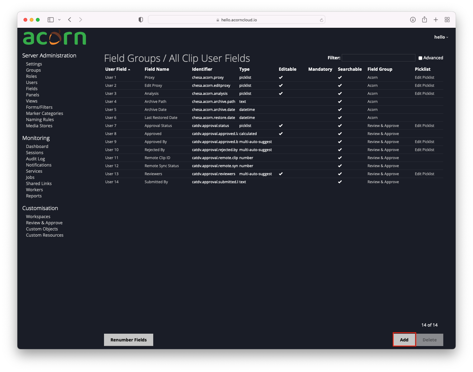
Clicking Fields in the admin toolbar displays the list of currently defined Fields.

The list displays the following fields:
User Field – system name used for creating unique fields
Field Name – the user-visible name of the field, which will be used as the label when the field appears in the UI. Hovering over the name displays the internal identifier for the field. Clicking on the name opens the edit dialog.
Identifier – internal identifier
Type – specifies the kind of information that can be stored and the type of UI control that will be used by the user to enter it
Editable – can the user change the value in this field.
Mandatory – if true the user must fill this value in before they are allowed to save the clip.
Searchable – if true the field will be indexed for searches
Field Group – system name used for creating unique fields
Picklist– for field types where the user selects a value from a list clicking the Edit Picklist link opens the Edit List dialog.
Create a User-Defined Field
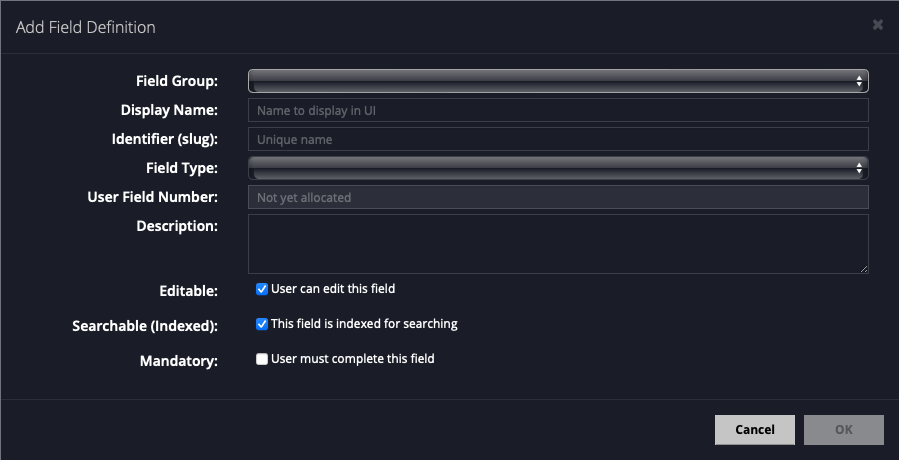
To create a new User-Defined Field click the Add button in the footer. This will open the Create/Edit Field Definition dialog:

The Create/Edit Field dialog contains the following fields: The list displays the following fields:
Field Group – the group the field applies to
Display Name – the user-visible name of the field, which will be used as the label when the field appears in the UI.
Identifier (slug) – internal unique name used to identify a field in API calls. For example if a clip field existed with the identifier ‘my.field’ then the JSON clip object would look like:
{ "ID": 1234, ..., "userFields": { "my.field" : "some value"}}
When used in a clip query this field would be referenced by:
((clip[my.field])eq(some value))
Type – specifies the kind of information that can be stored and the type of UI control that will be used by the user to enter it
Description – longer description of the field that is displayed as a tooltip in some clients.
Editable – can the user change the value in this field
Searchable (Indexed) – defines if this field should be indexed for searching
Mandatory – if true the user must fill this value in before they are allowed to save the clip.
Edit Picklist
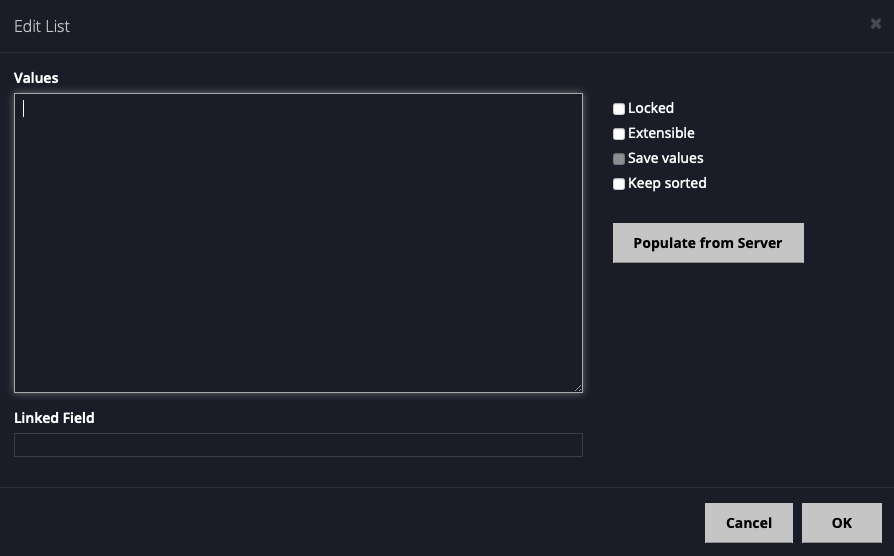
Clicking on the Edit Picklist link found in the Picklist column brings up the Edit List dialog:

The list values are entered into the Values field on the left. This is a single multi-line text field, where each line is one value. This makes it very easy to edit the values and also to copy/paste them from another document.
There are four options that can be set on picklists:
Locked – the values can only be changed by an administrator.
Extensible – user is allowed to enter values that are not in the list.
Save Values – new values entered are saved to the list (not all clients support this).
Keep Sorted – values are automatically sorted alphabetically.
